


EN
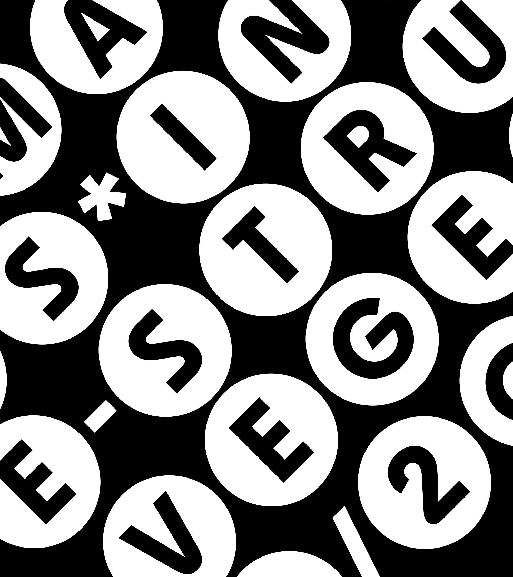
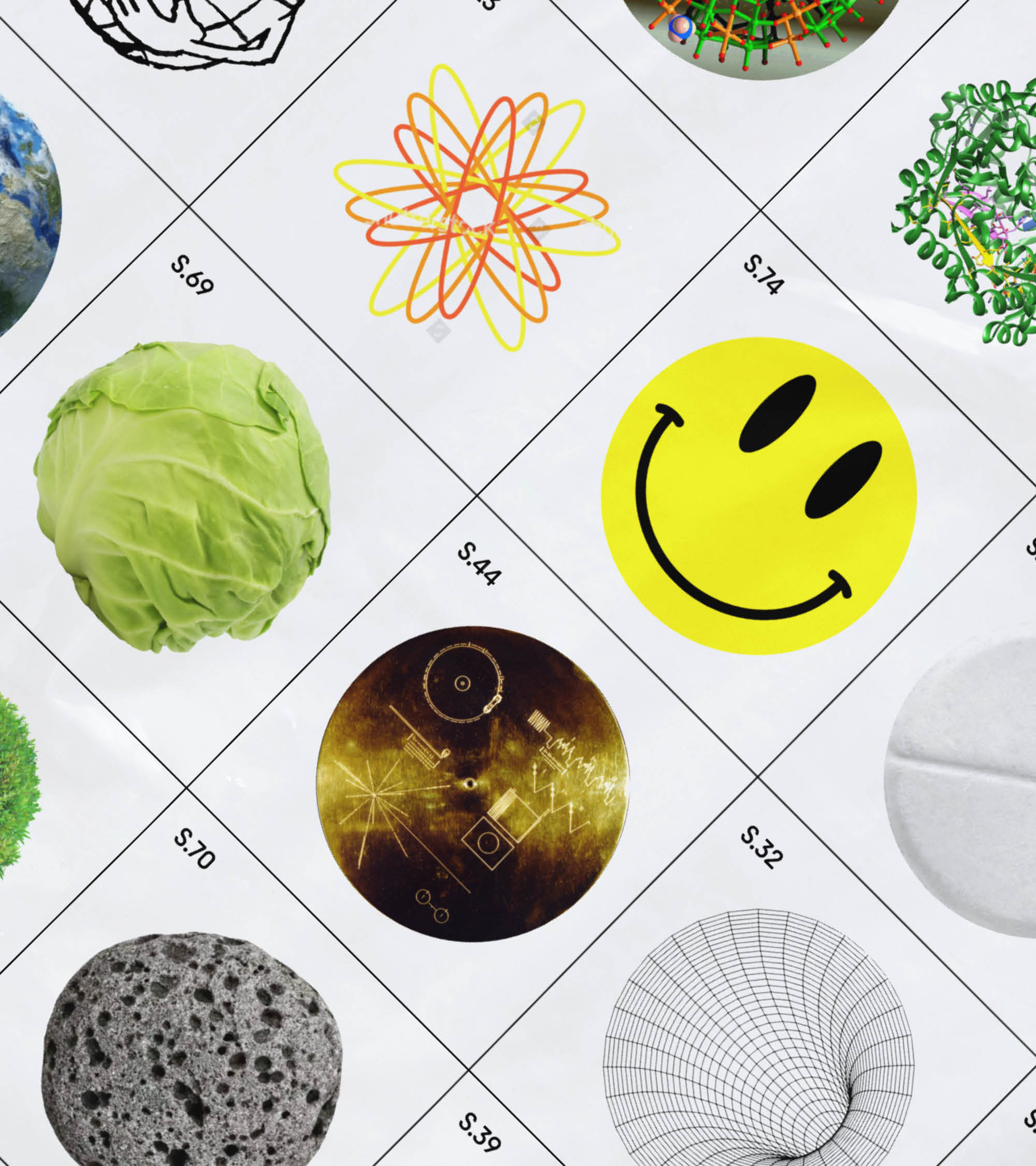
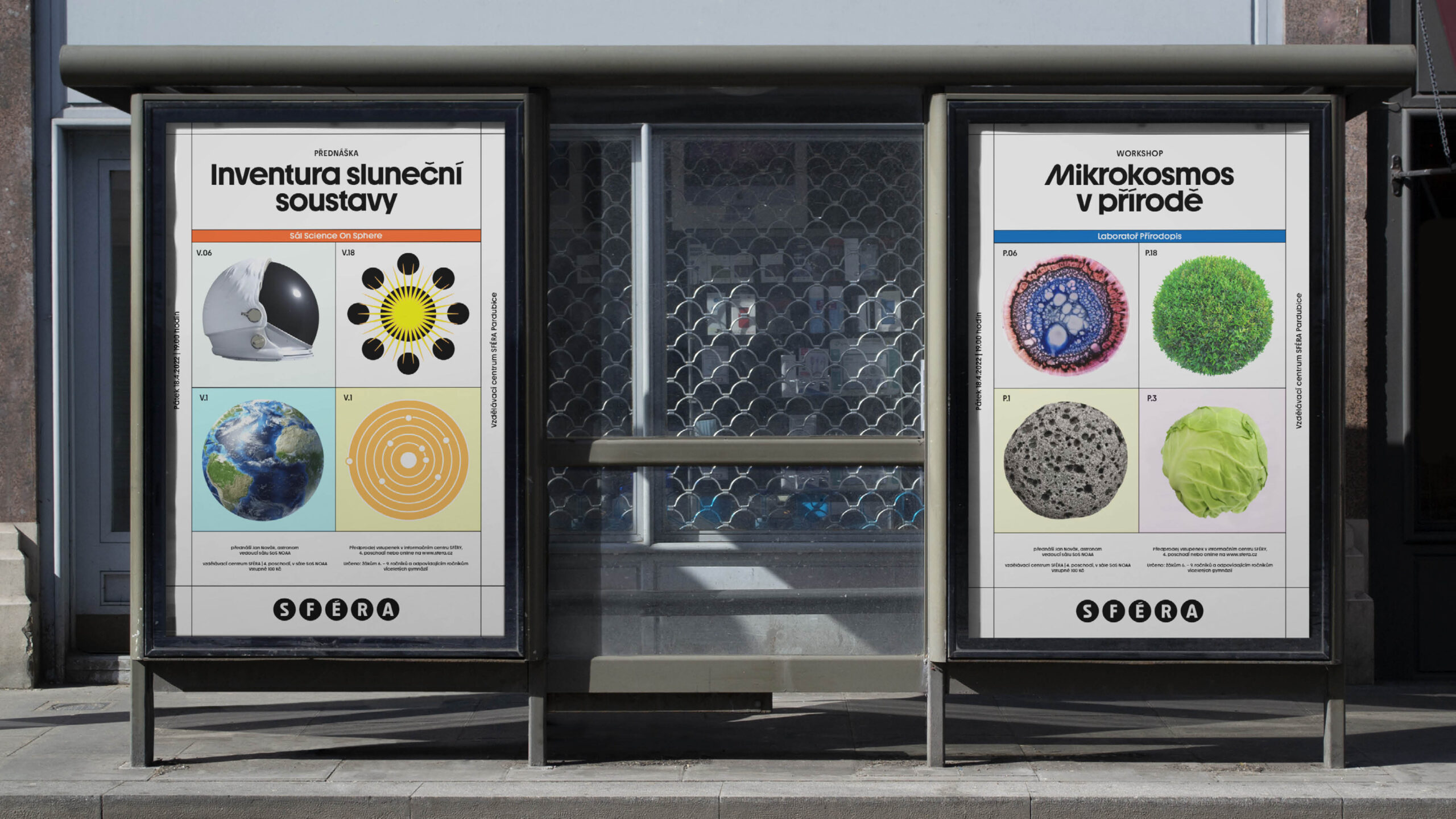
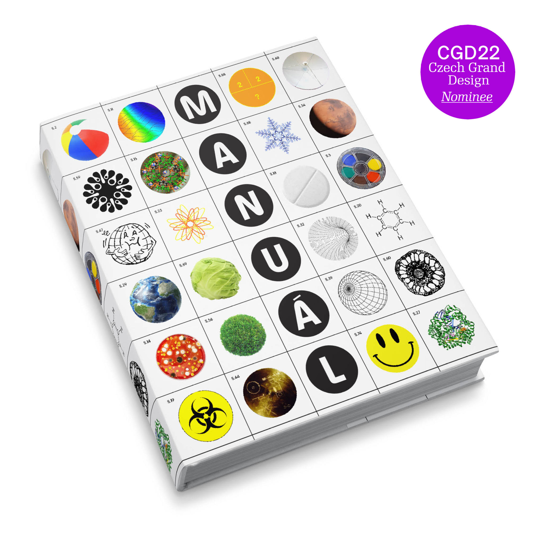
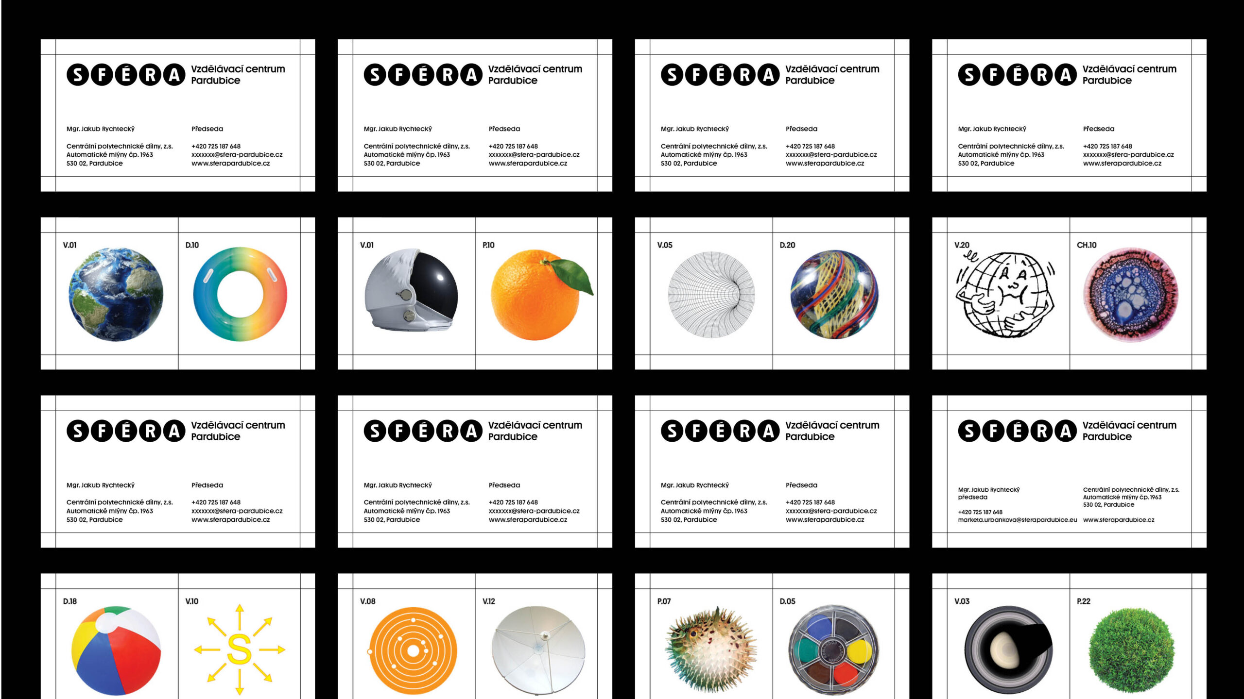
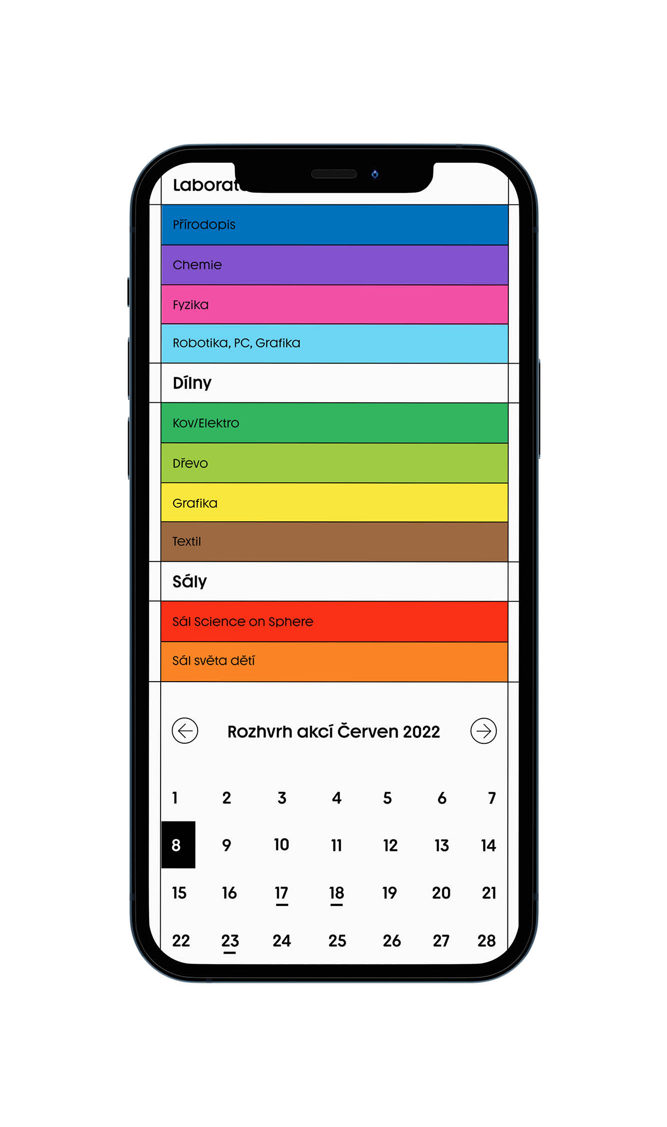
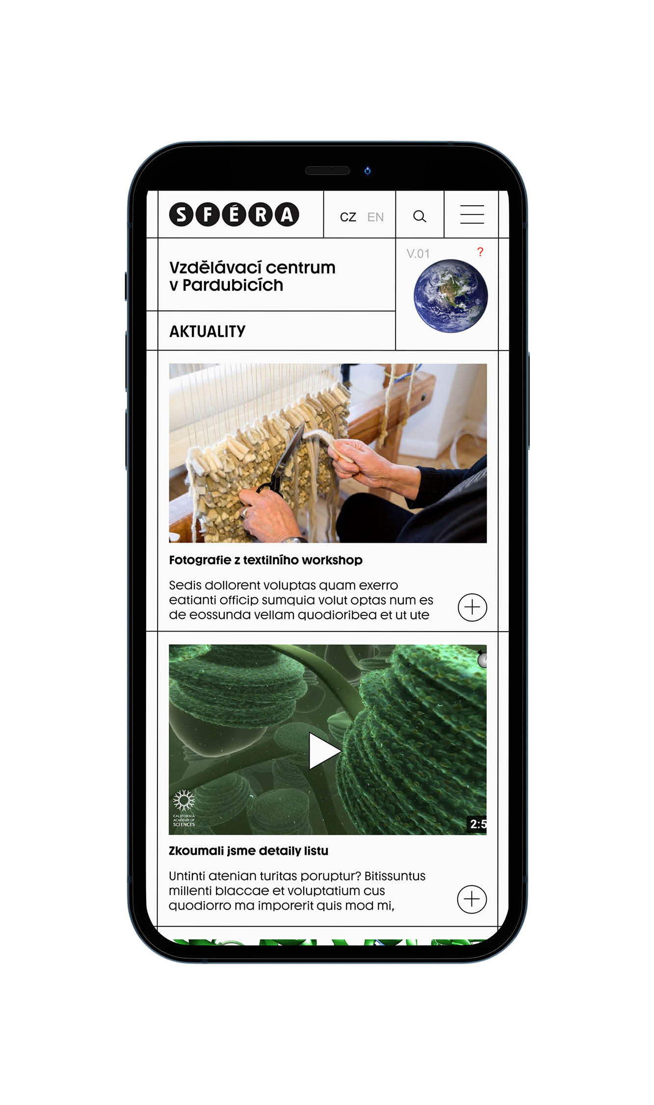
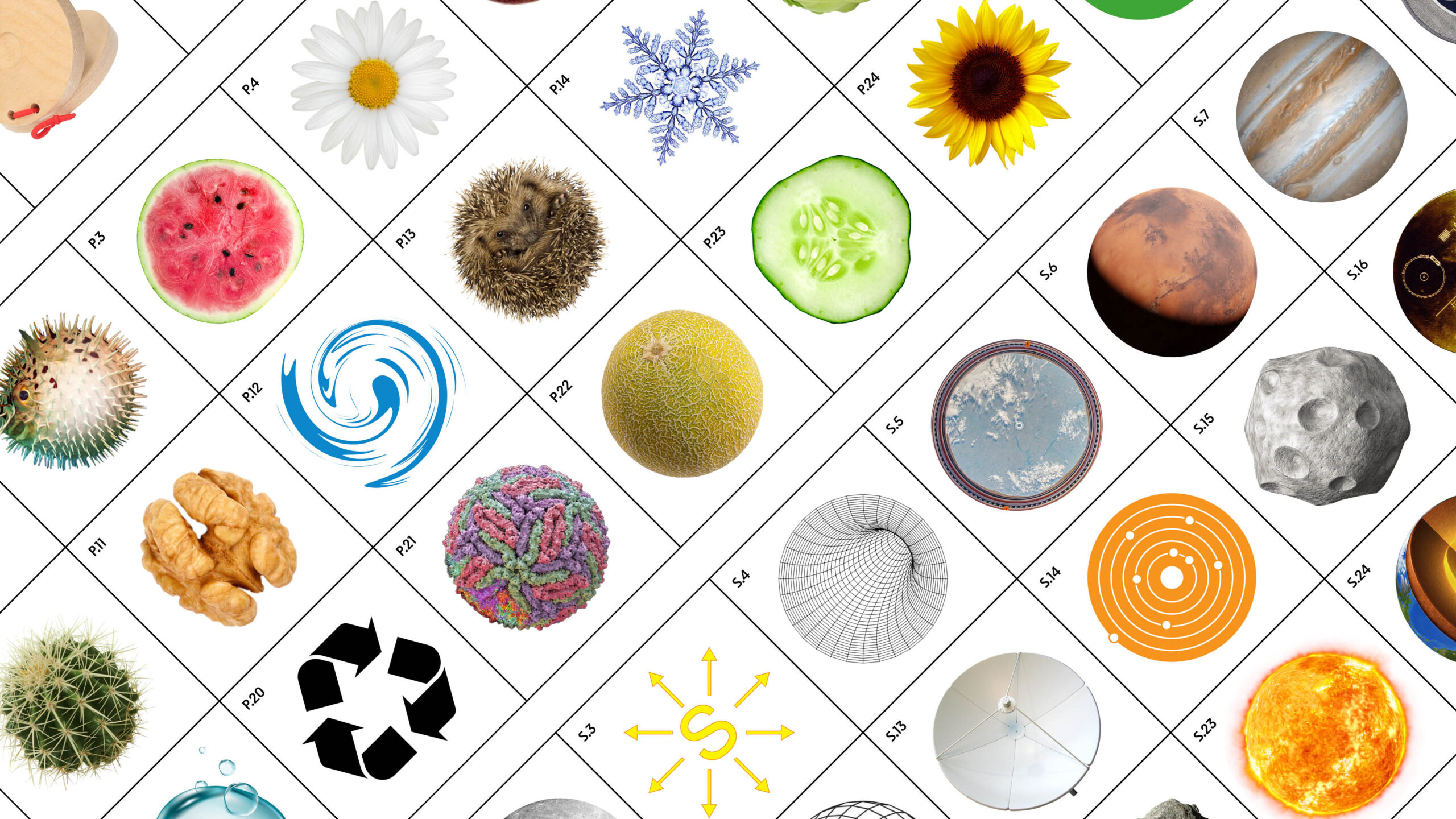
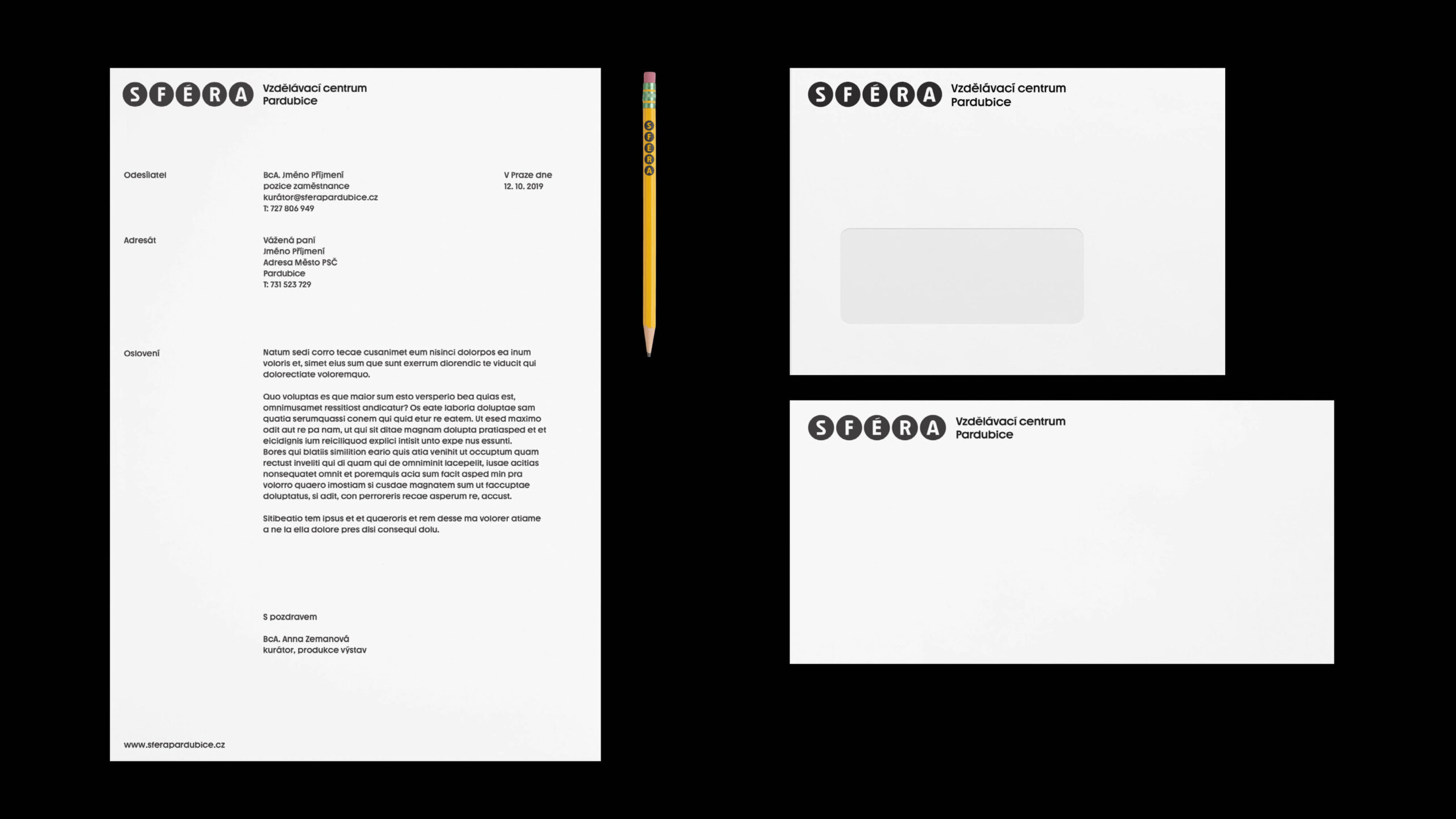
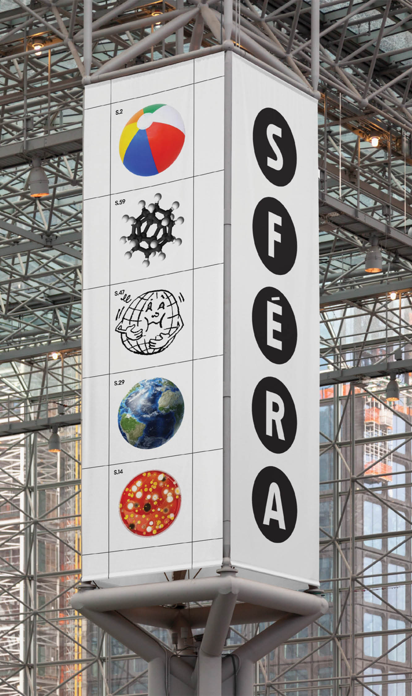
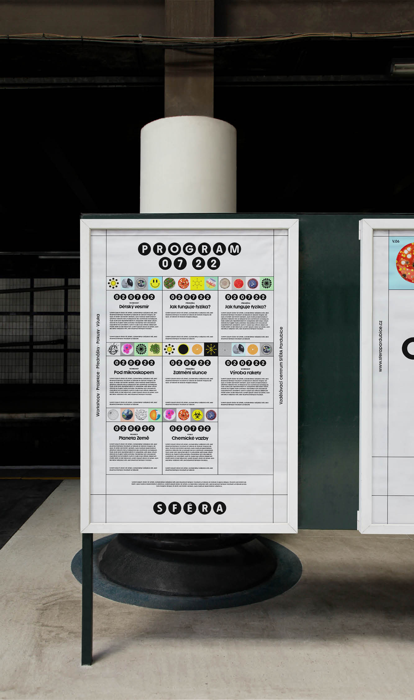
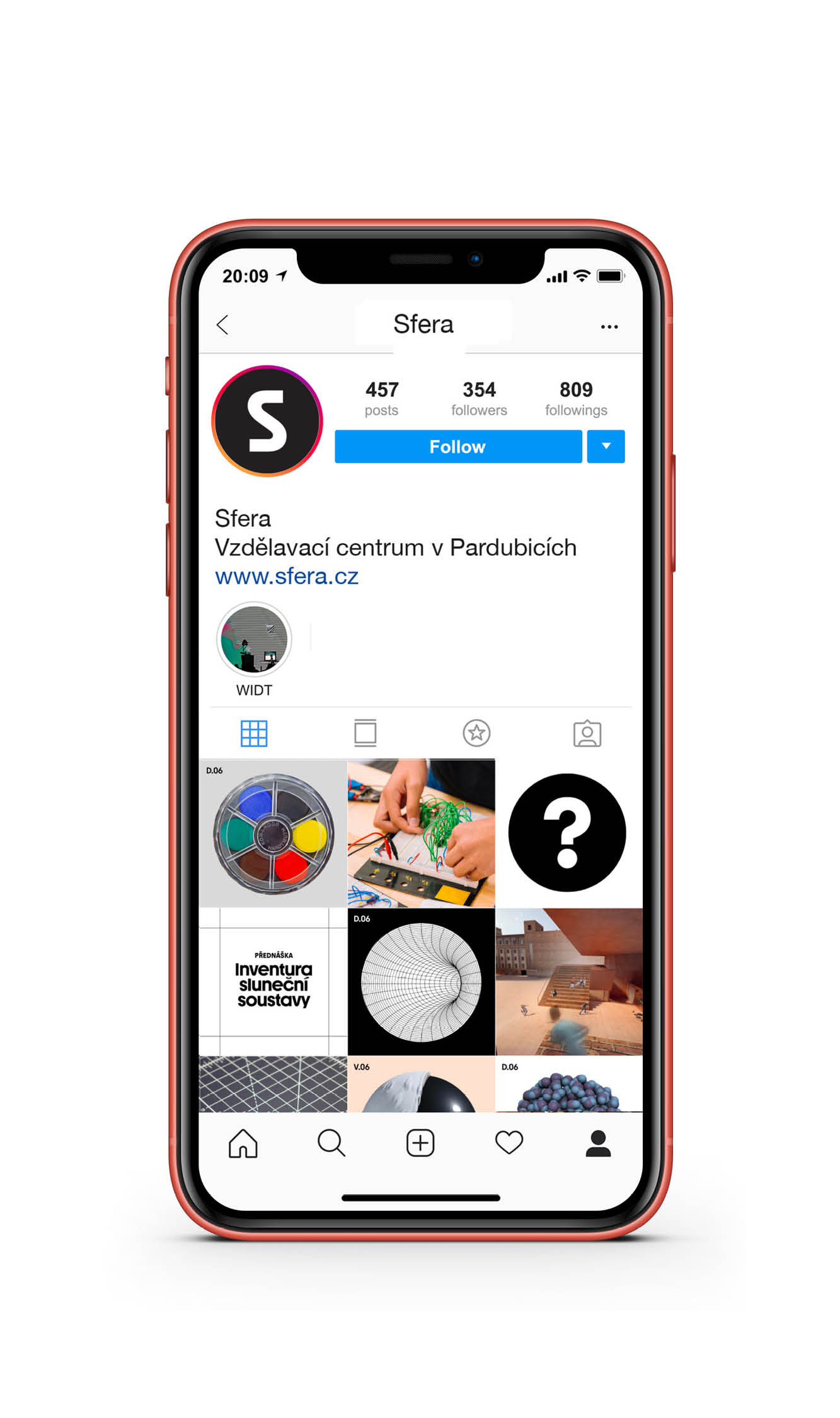
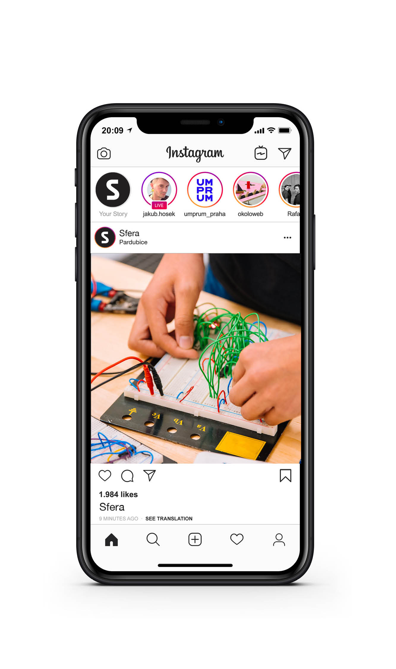
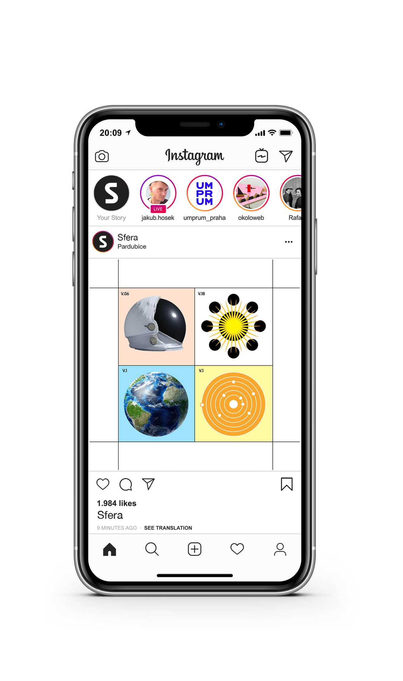
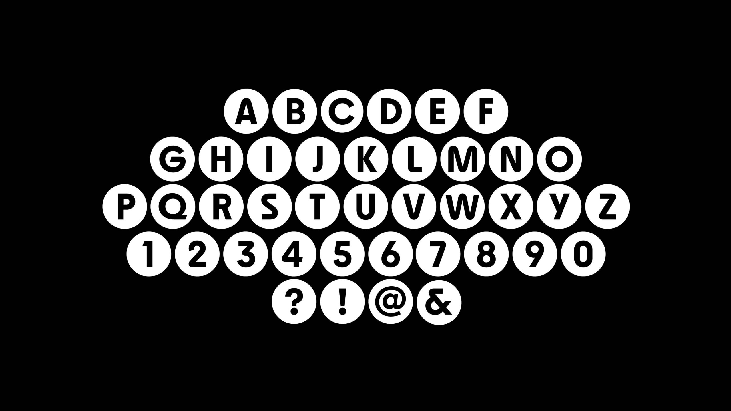
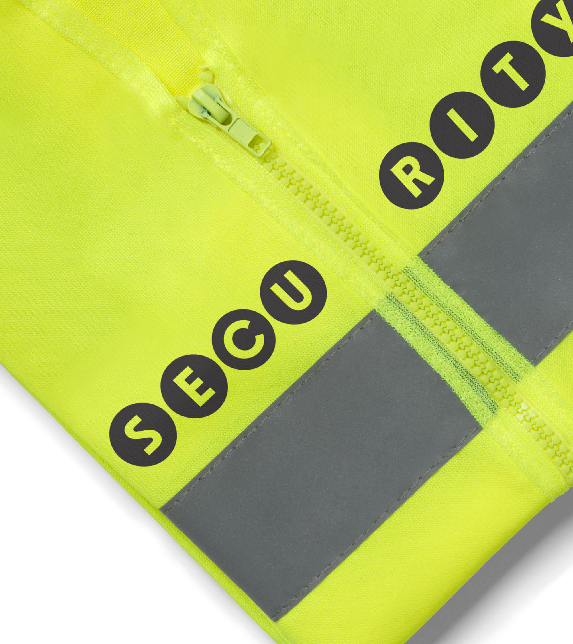
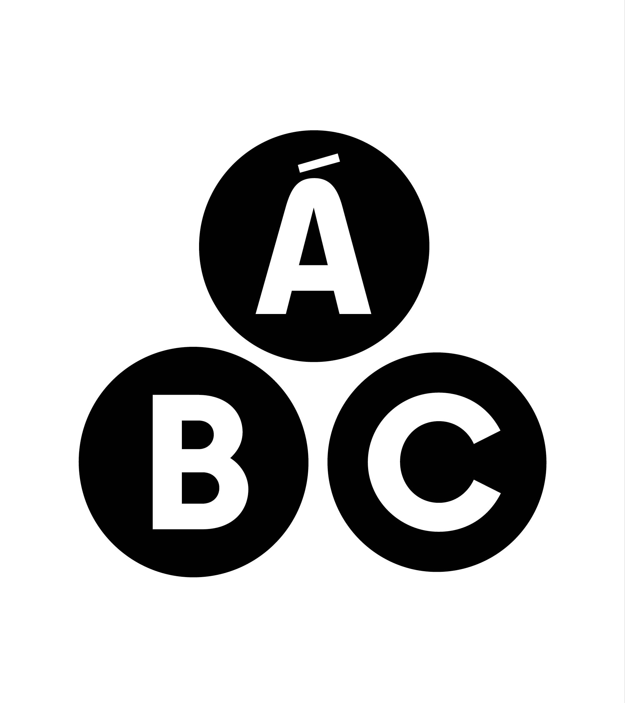
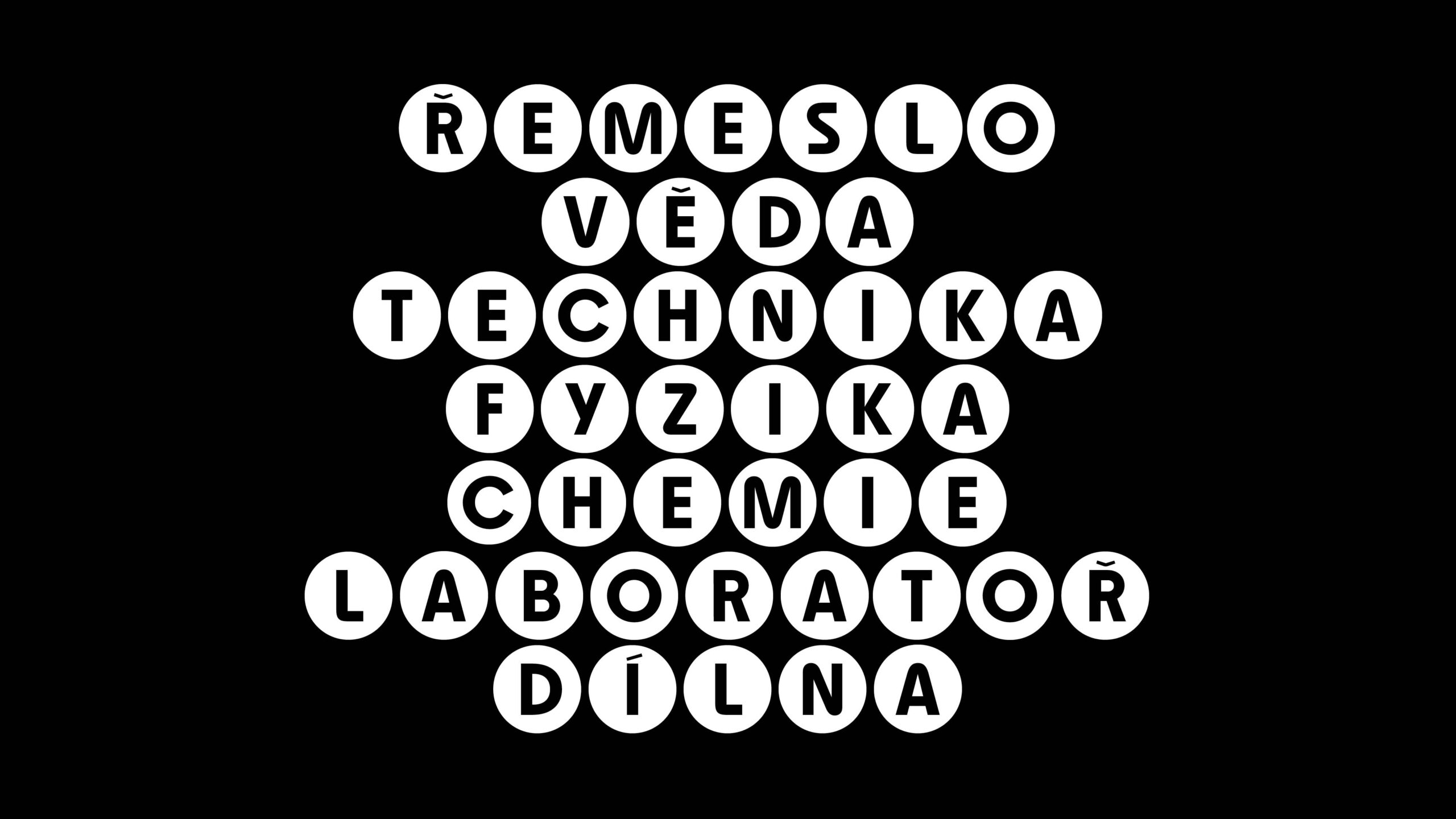
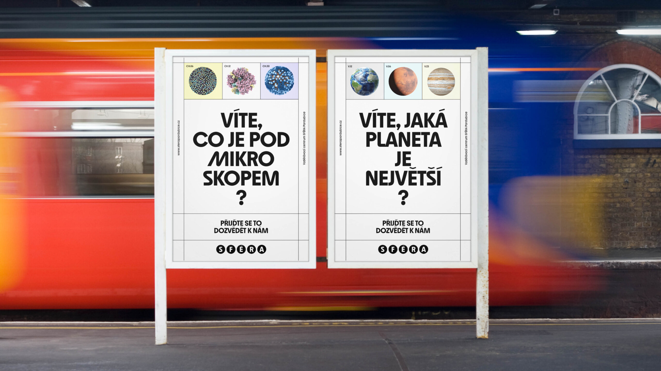
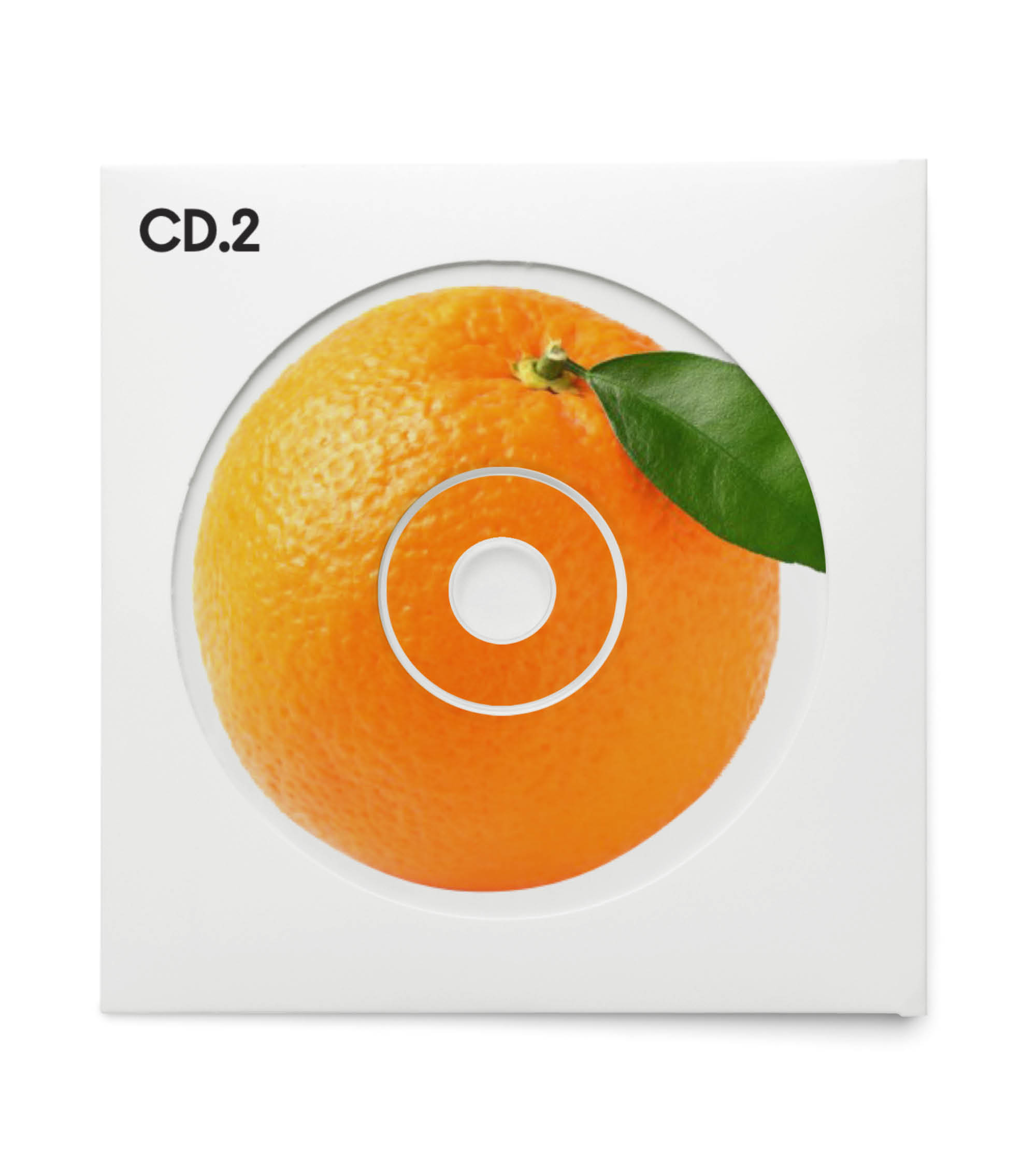
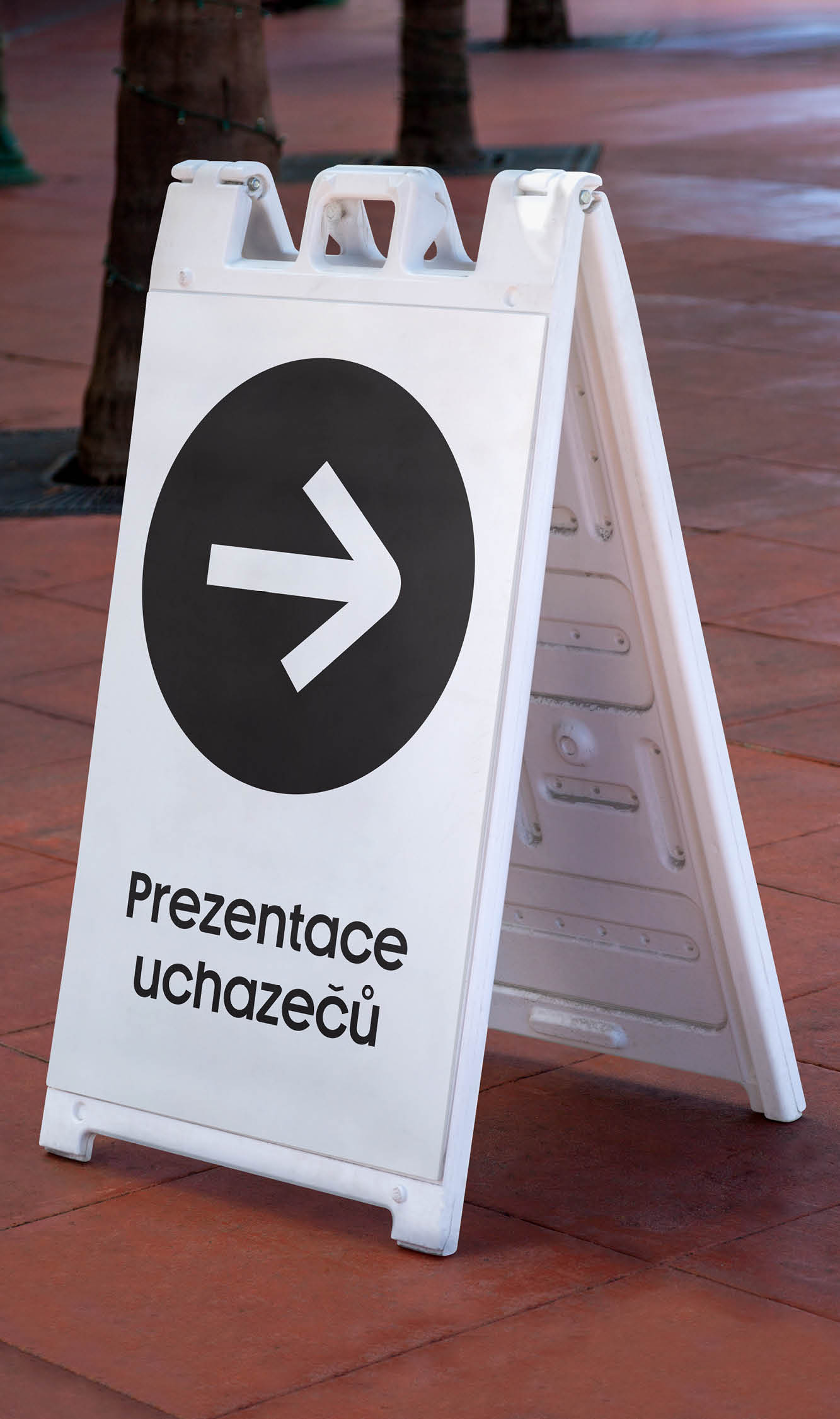
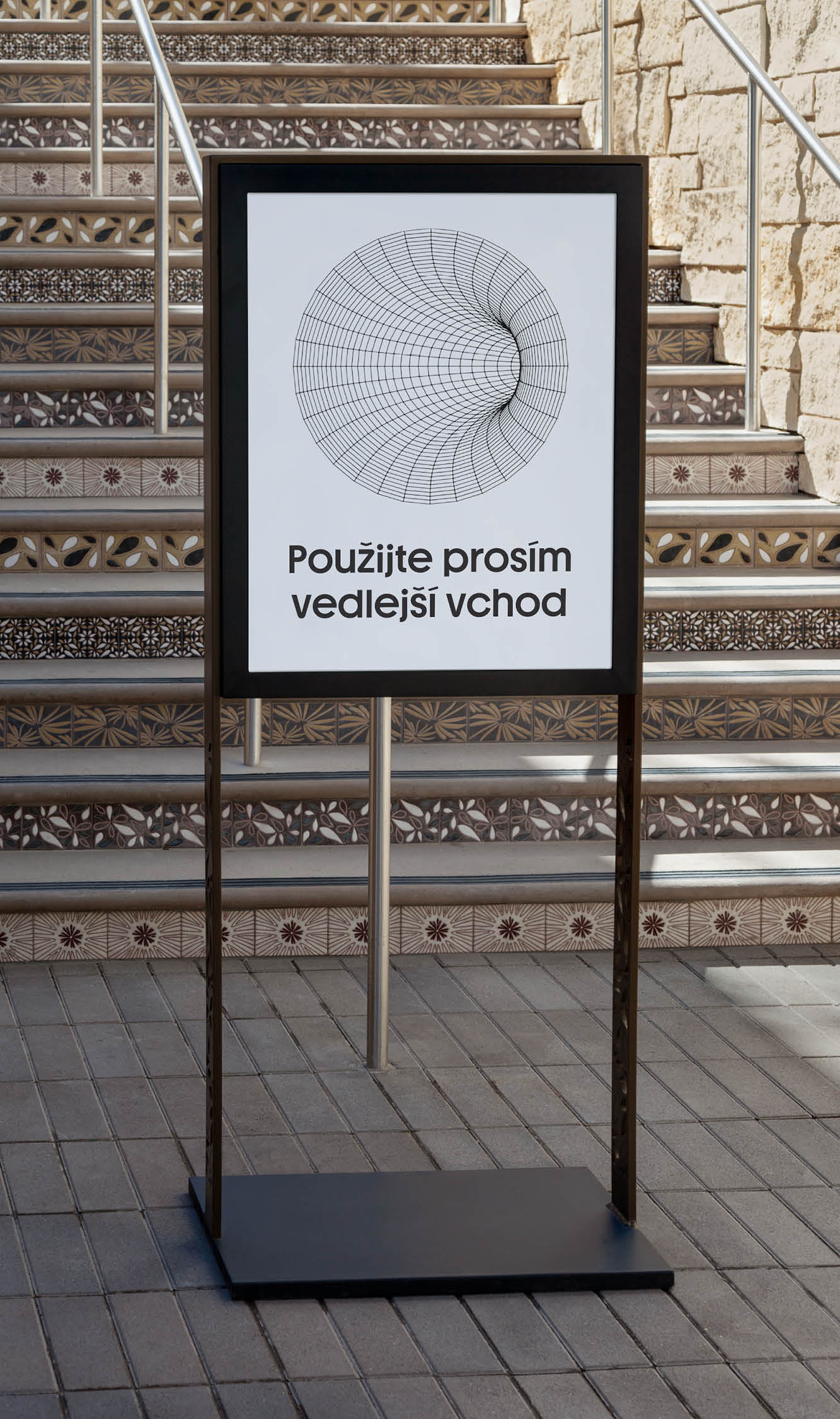
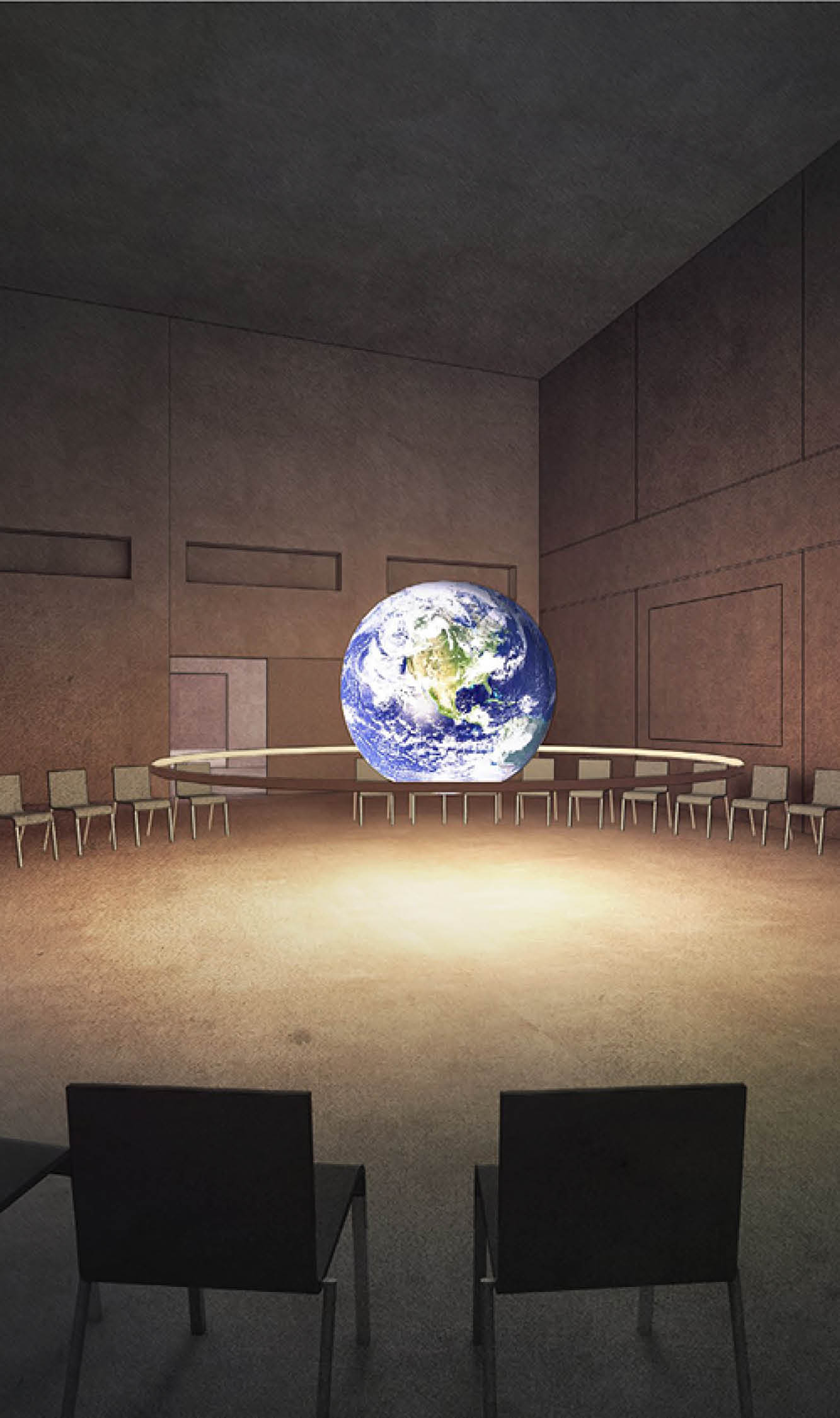
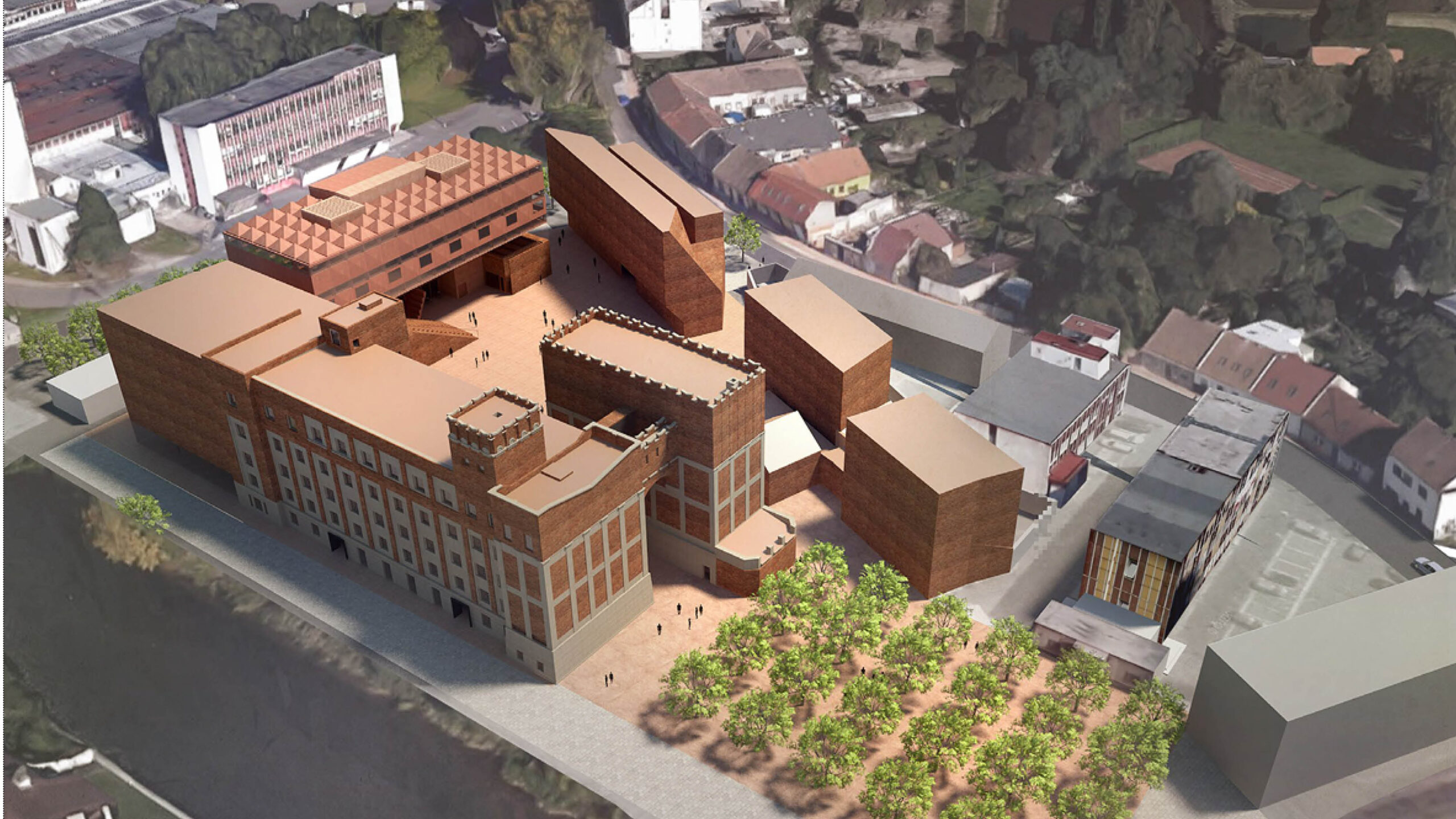
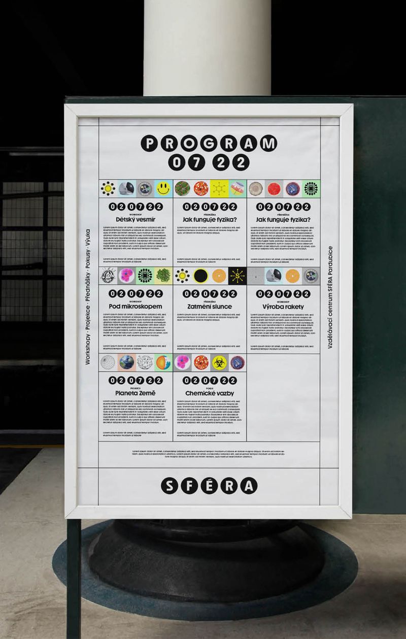
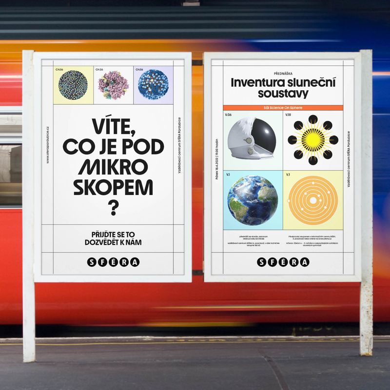
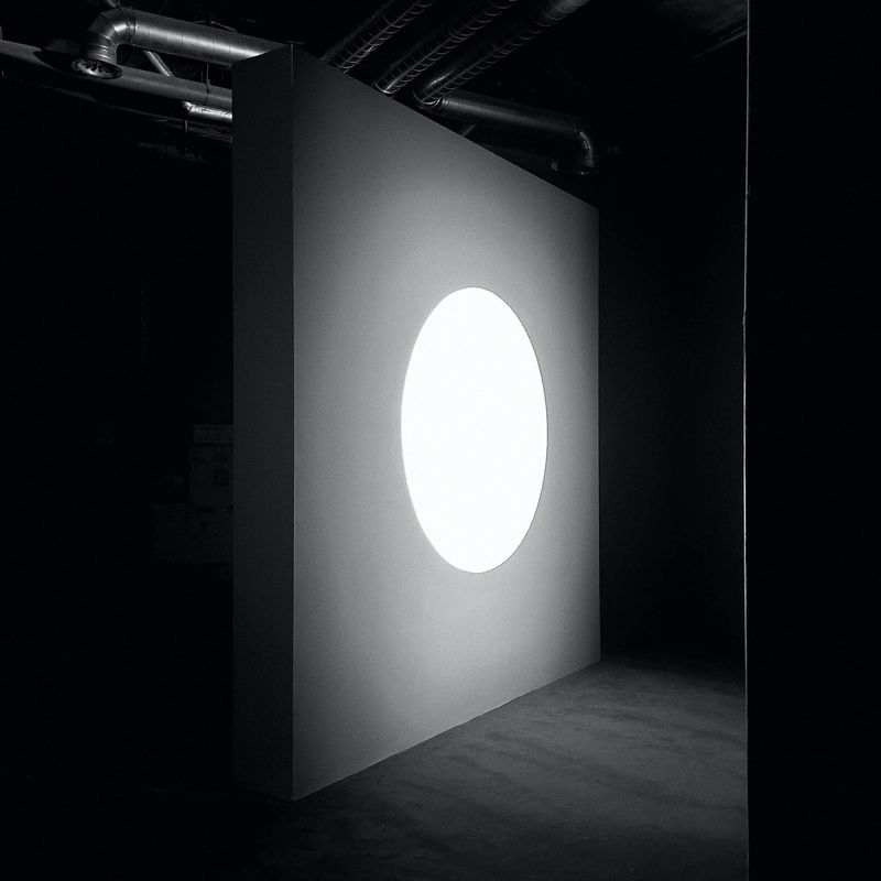
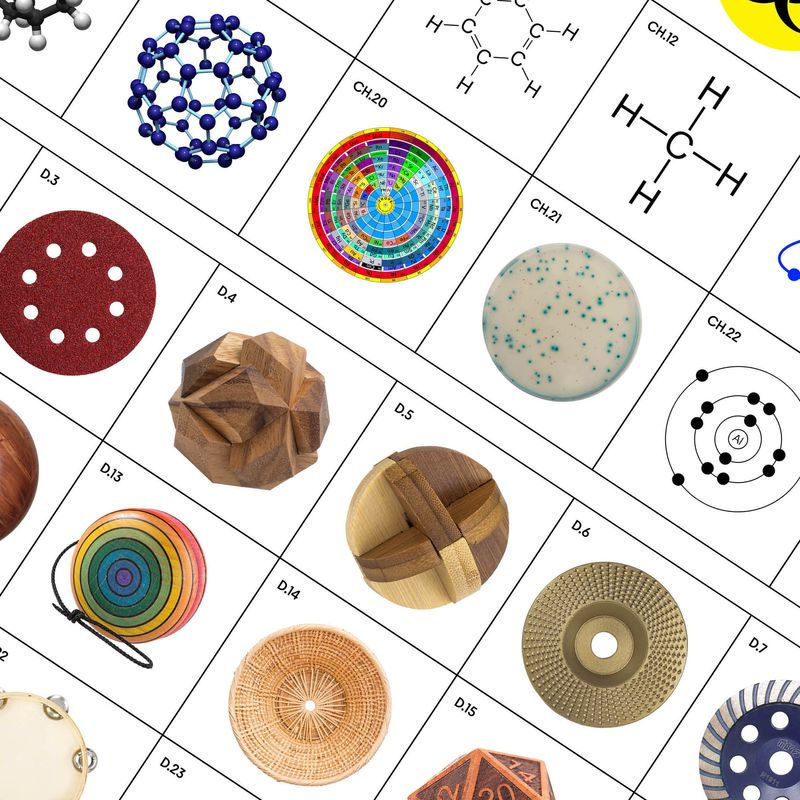
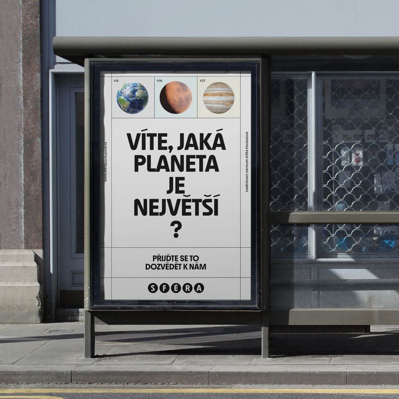
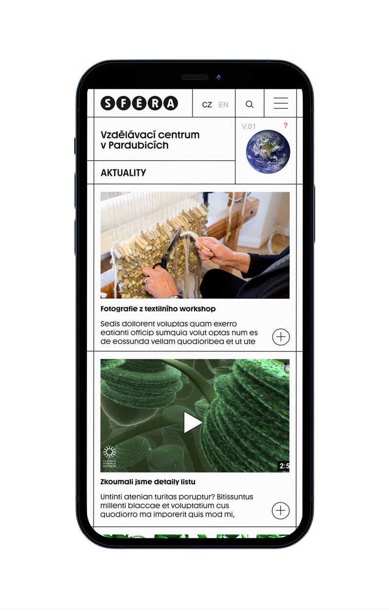
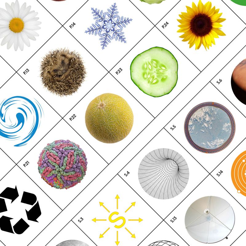
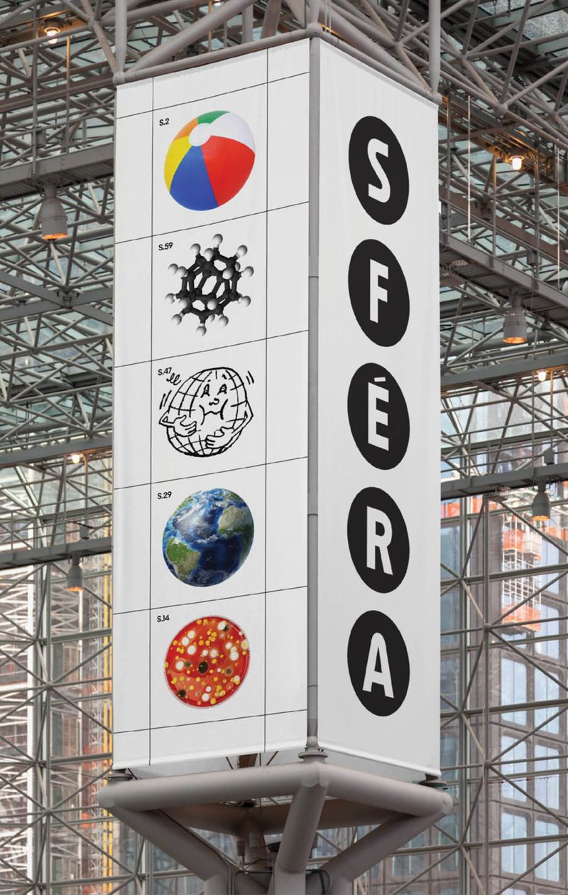
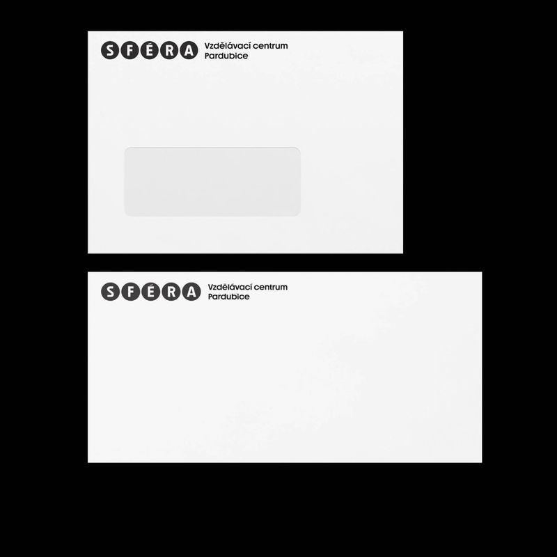
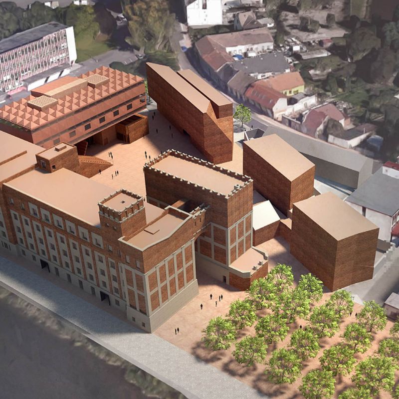
Visual identity for the educational center SFÉRA, located in the new spaces of Automatic Mills in Pardubice, designed by Jan Šépka Architects. The visual identity is the winning proposal from the announced competition. The basis of the visual identity is symbol of the circle, which refers to the name and concept of the institution. Then variable grid, which defines the layout of the visual and, above all, the image sets that hold a uniform visual content to the specific focus of the studios, laboratories and workshops. For the institution, we created an alternative cut of typeface Youth from All Caps type foundry, which also defines the logotype. The basic pillars of visuality were expertise, systematics, availability and, last but not least, the subsequent simple execution within the institution. Visual identity of Sfera was nominated by Czech grand design awards in category Graphic designer of the year 2022.
CZ
Vizuální identita pro vzdělávací centrum SFÉRA, nacházející se v novém areálu Automatických Mlýnů v Pardubicích, navrhnutém Jan Šépka Architects. Vizuální identita je vítězným návrhem z vypsané soutěže. Základem vizuální identity je symbol kruhu, který odkazuje k názvu a konceptu instituce. Dále variabilní grid, který definuje kompozice a především obrazové sady, které drží jednotný vizuální obsah ke konkrétním zaměřením ateliérů, laboratoří a dílen. Pro instituci byl námi vytvořen alternativní řez písma Youth od All Caps type foundry, který tvoří i základ logotypu. Základními pilíři vizuality byla odbornost, systematika, dostupnost a v neposlední řadě i následná jednoduchá exekuce uvnitř instituce, k čemuž slouží otevřené obrazové sady.
2022
Work/Práce:
Art Direction, Concept, Visual identity,
Corporate Identity, Motion design
Client/Klient:
Sféra Pardubice
Design & Art Direction:
Jiří Mocek, Cindy Kutíková, Daniel Šmíra